

The Shapes of Trust
A visual alphabet of form, meaning, and intention at Pulp Fictitious
Each of our icons is abstraction of meaning, drawn from the same language of color, form, and philosophy that is the foundation of everything we create.
Here’s the story behind the four symbols you’ll find across our site:

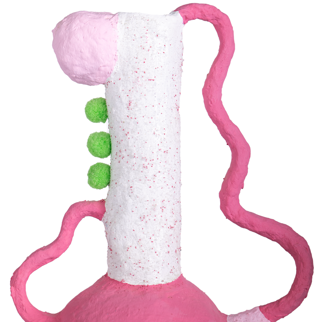
made to last
hand-built in small batches
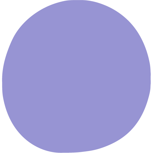
Shape: Full Circle
Color: Purple
The full circle represents a complete process, hand-built in small batches from start to finish with care. Taking an idea from concept to creation, allowing it to come full circle. Like the circle that never breaks, it holds its form. Our pieces are made to last.
Purple deepens the story. It mirrors the thoughtful process behind every handmade piece, imaginative yet grounded. A subtle luxury that feels intentional, crafted to hold space.

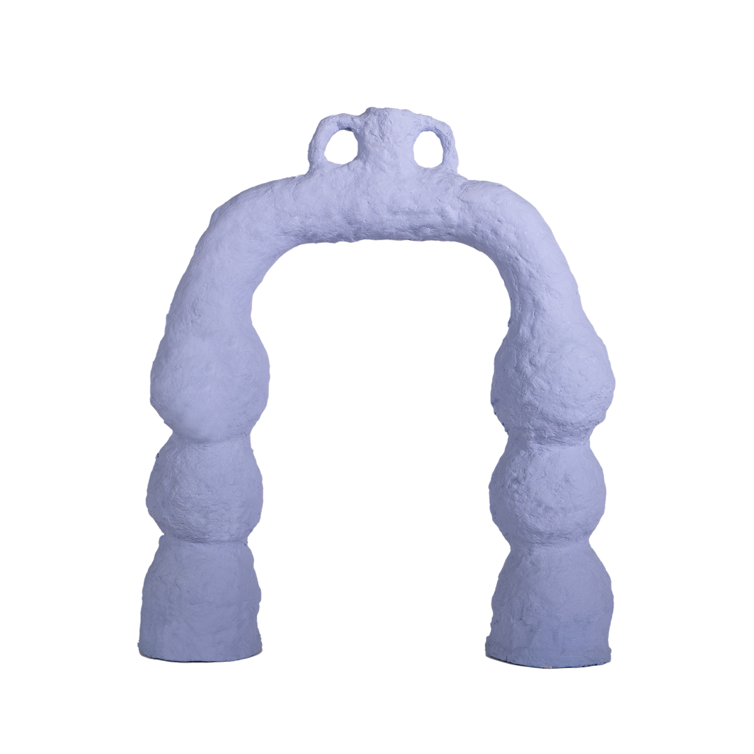
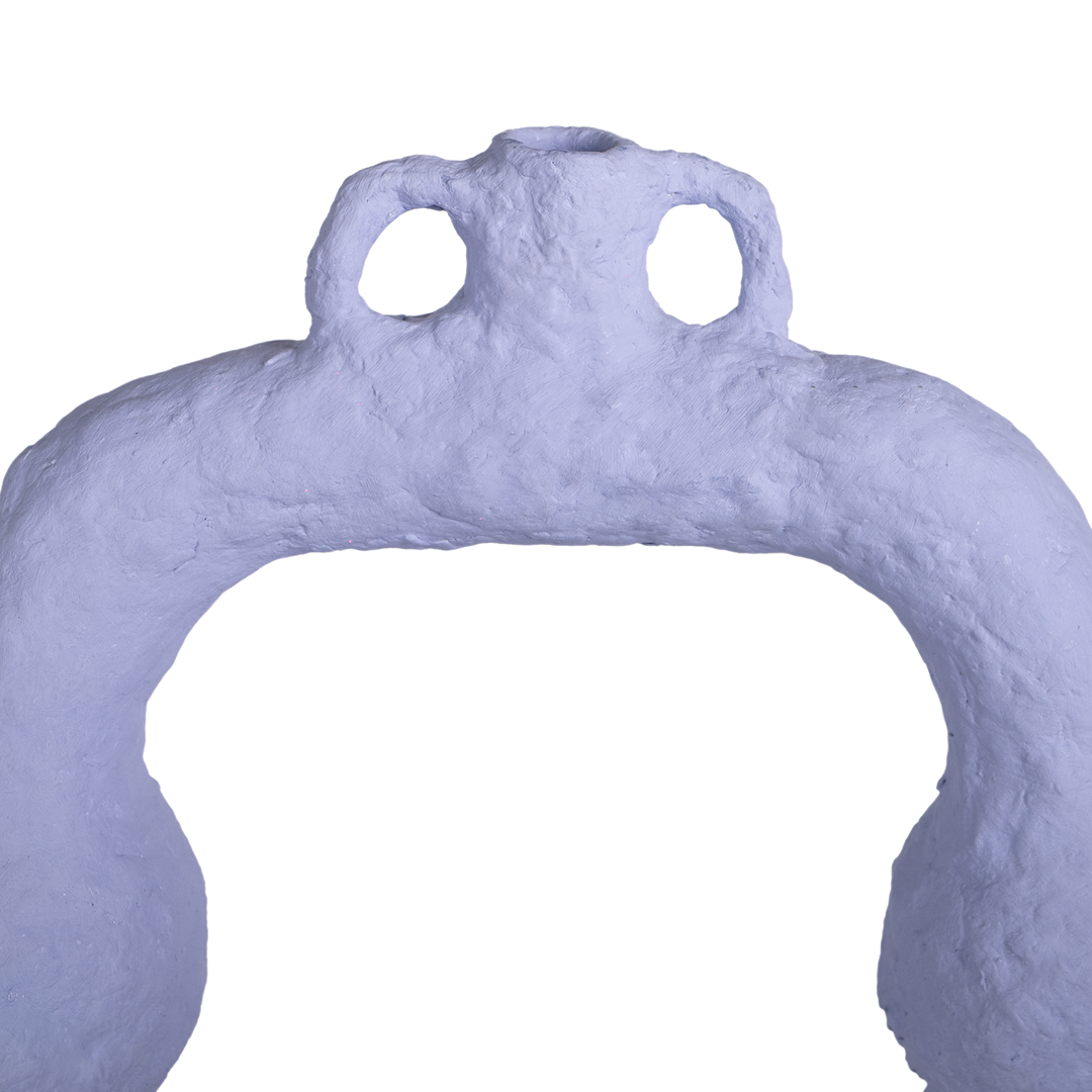
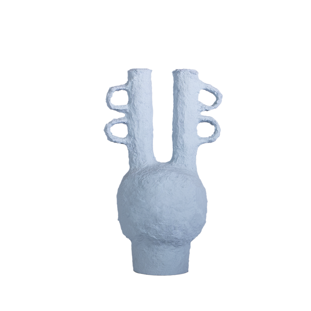
intentionally finite
released in limited runs. never repeated.
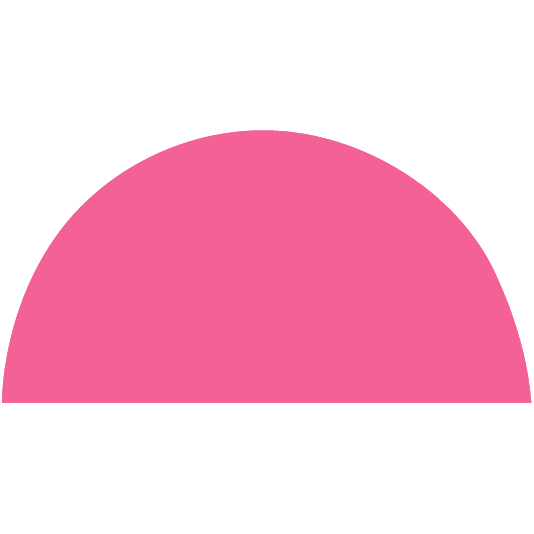
Shape: Half Arch
Color: Cobalt Blue
The half arch references one half of the infinity symbol. Open yet deliberately incomplete, leaving room for interpretation. It allows each piece to find its place naturally. It marks our belief in making only what matters, crafted in small, non-repeating editions.
Cobalt blue signals clarity and intention. It reflects a cool resolve, design led by meaning, not mass.

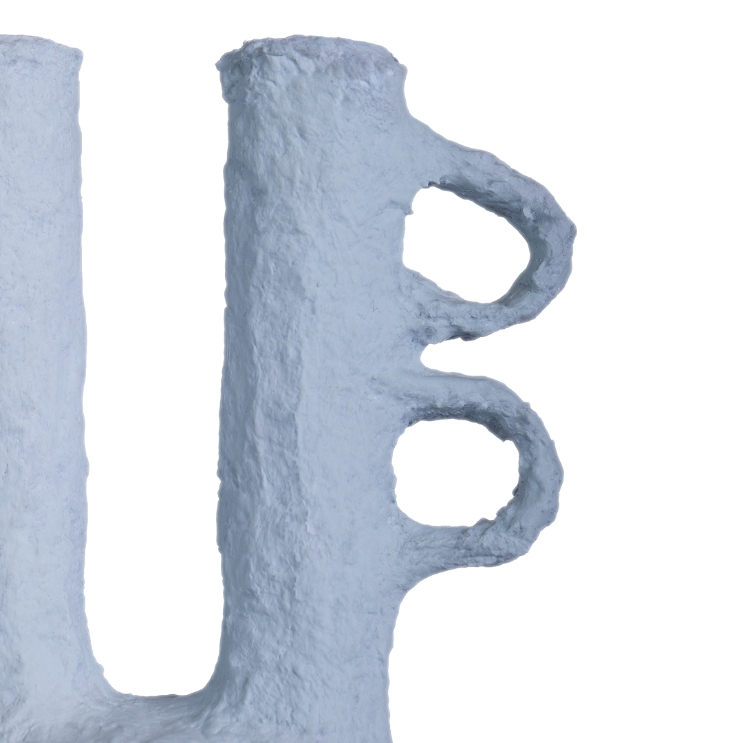
worldwide delivery
3–5 day shipping, with tracking.
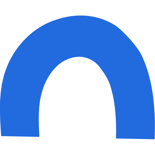
Shape: Quarter Circle
Color: Sky Blue
The quarter circle suggests expansion and outreach, much like how we connect with a global audience. It hints at motion and connection, the way our work moves from hand to hand, across borders. Sky blue mirrors open skies and limitless horizons. It conveys a sense of endless possibility and unrestricted movement.
This icon quietly promises global reach, reliable delivery, and thoughtful experience.

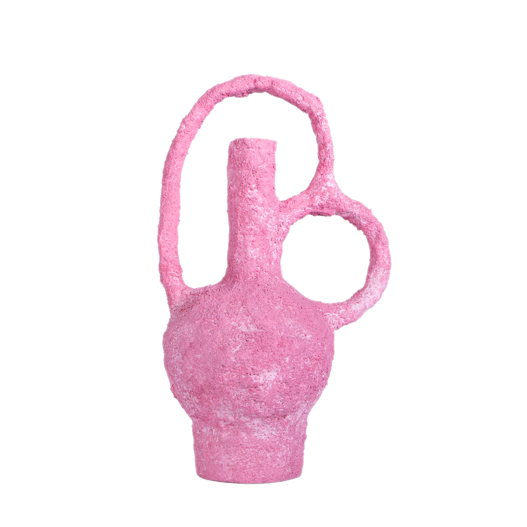
packed with care
plastic-free, planet-loving, and recyclable.
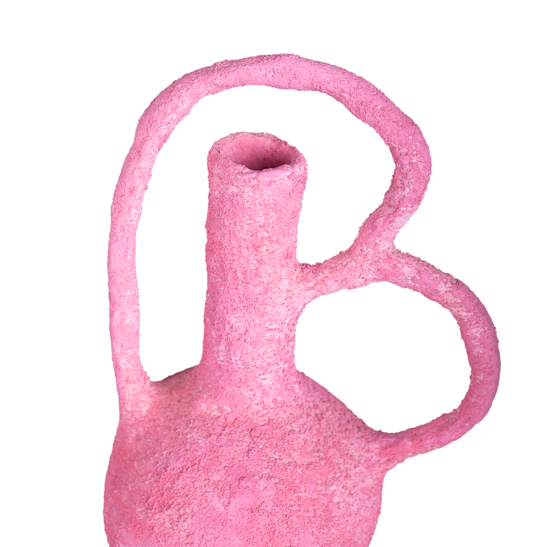
Shape: Semi-Circle (Bowl)
Color: Rose Pink
A bowl gathers and protects, designed to hold something with care. Paired with a warm rose pink, it speaks to softness, strength, and considered protection. Rose pink feels comforting and approachable, making the unboxing experience personal and thoughtful.
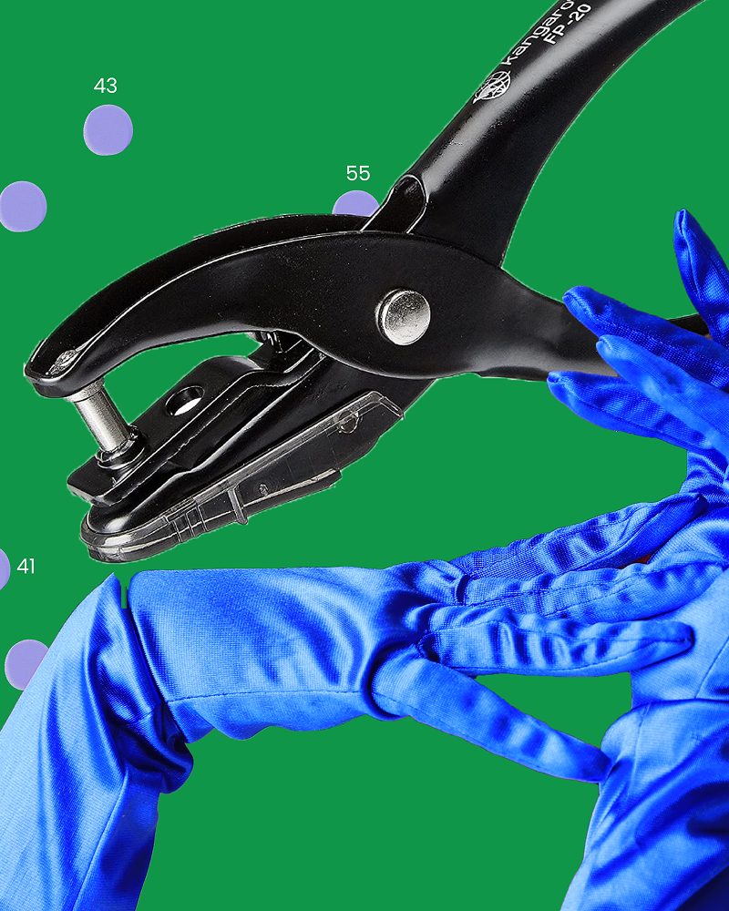
Together, We Are Green
![]()
Every form you’ve seen—circle, arch, curve, and bowl—is part of a greater whole. Together, they shape our logo. Like every choice we make, this one is intentional.
The green square that frames it? That’s our grounding.
It’s our mixture of pulp—green, food and plant-based.
Each ingredient in our pulp is picked from a memory lane of the founder’s childhood home.
Green is growth, the color of starting over, of finding new life.
For us, that’s discarded paper’s life.

Leave a comment
All comments are moderated before being published.
This site is protected by hCaptcha and the hCaptcha Privacy Policy and Terms of Service apply.